sexta-feira, 13 de novembro de 2009
quinta-feira, 12 de novembro de 2009
segunda-feira, 9 de novembro de 2009
domingo, 8 de novembro de 2009
sexta-feira, 6 de novembro de 2009
42 - ANALYSIS
 EMOTIONAL STATEMENT :
Two guys are sitting on a table. I will call them the ‘thin guy’ and the ‘fat guy’. The thin guy has a pizza and the fat guy a plate of salad.
The fat guy is kind of mad, it seems that he wants the pizza, or maybe he just desagreeing about what the thin one is saying.
The fat guy has both hands on the table and his head is inclined in the direction of the thin guy with an unfriendly expression in his face. I think this helps to give him the agressive look.
The thin guy has his shoulder moved up and both hands are in the air… like he is explaining something to the other guy. His face is very funny and his body is inclined backwards.
As I said, I haven’t watched this show, but reading the image I would guess that they are talking about food… and the fat guy is not happy because he got salad insted of pizza… but I can be wrong.
VISUAL CONTRASTS :
OBERVATION 01 : to use the ‘HIERARCHY’ principle we can fit them in a larger and simple shape. Doing this we slice the image in 3 parts, the most important is the one in the midle, where we find our characters.
OBERVATION 02 : going ahead with the hierarchy principle I separeted the larger slice in the midle in two more complex shapes that will help me to get their silhouettes and the negative space between them.
OBERVATION 03 : their axes are inclined in opositte ways, creating a ‘V’ shape. Their forehead, eyes, nose and chin are at the same level. I think this will help to draw both guys with more accuracy.
OBERVATION 04 : -CURVES- I found some ‘S’curves in their axes and also ‘C’ shape curves in both their shoulders and hands.
OBERVATION 05 : secundary elements… Moving the attention from the main characters we find the pizza box, the plate with salad, one chair in the foreground and a door in the background (that gives us a good negative espace of the characters).
 DRAWING :
After analyse the picture I started to draw the realistic version of them.
STEP 01: I made a basic and simple shape that could fit both of them and divide it into more complex shapes that could give me something similar to their silhouette.
STEP 02: I started to make the structure of the characters, finding the areas that were more important to the expression (eyes, nose, mouth) some information of the clothing etc…
STEP 03: I checked the scketch with the original picture… AHHH… it was very different. Both heads were out of place and the hands of the thin guy needed to be moved down…
STEP 04: I fixed the things that were wrong in the last step, tried to find more things to correct and got the red pencil to add the secondary elements.
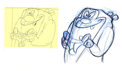
STEP 05: I finished with black pencil… I didn’ t like the results, specially of the thin guy… his expression was so funny in the picture, and it got very boring in my drawing (SHAME) . It is very hard to draw doing this bunch of analisis.. usually I do a mental analysis, but don’t think this much about what I am doing. I will do the caricature… more freely now and see what happens.
terça-feira, 3 de novembro de 2009
Assinar:
Comentários (Atom)


